Introduction to Random Walks in R
Dogukan Nami Oztas
2025-05-16
What is a Random Walk?
A random walk is a mathematical object, known as a stochastic or random process, that describes a path consisting of a succession of random steps. In our context, we’ll focus on one-dimensional random walks where a particle (representing evidence) moves along a line, taking random steps at each time point.
Mathematical Foundation
The discrete-time random walk model can be mathematically expressed as:
\[E_{t+1} = E_t + \mu + \epsilon_t\]
where: - \(E_t\) is the evidence at time \(t\) - \(\mu\) is the drift (average step size per time unit) - \(\epsilon_t \sim \mathcal{N}(0, \sigma^2)\) is random noise (Gaussian white noise)
The process continues until the evidence crosses one of two decision boundaries: - Upper threshold: \(E_t \geq +a\) → Decision “A” (choice = 1) - Lower threshold: \(E_t \leq -a\) → Decision “B” (choice = -1)
Connection to Decision Making
Random walks are fundamental to understanding decision-making models, particularly the Diffusion Decision Model (DDM). In psychological terms:
- Evidence accumulation: Information gradually builds up over time
- Decision thresholds: The amount of evidence needed to make a decision
- Drift: Bias toward one option over another
- Noise: Uncertainty and variability in the decision process
Simulating a Single Random Walk Trial
Let’s start by understanding how a single decision unfolds. We’ll use
the simulate_random_walk_trial() function to simulate
individual trials and visualize the evidence accumulation process.
Basic Single Trial Simulation
set.seed(123) # For reproducibility

# Example 1: Positive drift (bias toward upper threshold)
trial1 <- simulate_random_walk_trial(drift = 0.2, threshold = 5, sd_step = 1, return_path = TRUE)
cat("Trial 1 (positive drift):\n")
## Trial 1 (positive drift):## Choice = 1 , RT (steps) = 13# Example 2: Negative drift (bias toward lower threshold)
trial2 <- simulate_random_walk_trial(drift = -0.15, threshold = 5, sd_step = 1, return_path = TRUE)
cat("Trial 2 (negative drift):\n")## Trial 2 (negative drift):## Choice = -1 , RT (steps) = 12# Example 3: No drift (unbiased)
trial3 <- simulate_random_walk_trial(drift = 0, threshold = 5, sd_step = 1, return_path = TRUE)
cat("Trial 3 (no drift):\n")## Trial 3 (no drift):## Choice = 1 , RT (steps) = 31Visualizing Evidence Accumulation Paths
The power of the random walk model becomes clear when we visualize how evidence accumulates over time:
# Create plots for the three trials
plot_list <- list()

# Trial 1: Positive drift
plot_list[[1]] <- {
  df1 <- data.frame(
    time = 0:(length(trial1$evidence_path) - 1),
    evidence = trial1$evidence_path
  )

  ggplot(df1, aes(x = time, y = evidence)) +
    geom_line(color = "blue", size = 1) +
    geom_hline(yintercept = c(-5, 5), linetype = "dashed", color = "red", size = 1) +
    geom_hline(yintercept = 0, linetype = "dotted", color = "gray") +
    geom_point(data = df1[nrow(df1), ], color = "red", size = 3) +
    labs(title = "Trial 1: Positive Drift (μ = 0.2)",
         subtitle = paste("Choice:", trial1$choice, "| RT:", trial1$rt, "steps"),
         x = "Time Steps", y = "Evidence") +
    ylim(-6, 6) +
    annotate("text", x = max(df1$time) * 0.1, y = 5.5, label = "Upper Threshold", color = "red") +
    annotate("text", x = max(df1$time) * 0.1, y = -5.5, label = "Lower Threshold", color = "red")+
    xlim(-0.5, 15)
}

# Trial 2: Negative drift
plot_list[[2]] <- {
  df2 <- data.frame(
    time = 0:(length(trial2$evidence_path) - 1),
    evidence = trial2$evidence_path
  )

  ggplot(df2, aes(x = time, y = evidence)) +
    geom_line(color = "darkgreen", size = 1) +
    geom_hline(yintercept = c(-5, 5), linetype = "dashed", color = "red", size = 1) +
    geom_hline(yintercept = 0, linetype = "dotted", color = "gray") +
    geom_point(data = df2[nrow(df2), ], color = "red", size = 3) +
    labs(title = "Trial 2: Negative Drift (μ = -0.15)",
         subtitle = paste("Choice:", trial2$choice, "| RT:", trial2$rt, "steps"),
         x = "Time Steps", y = "Evidence") +
    ylim(-6, 6)+
    xlim(-0.5, 15)
}

# Trial 3: No drift
plot_list[[3]] <- {
  df3 <- data.frame(
    time = 0:(length(trial3$evidence_path) - 1),
    evidence = trial3$evidence_path
  )

  ggplot(df3, aes(x = time, y = evidence)) +
    geom_line(color = "purple", size = 1) +
    geom_hline(yintercept = c(-5, 5), linetype = "dashed", color = "red", size = 1) +
    geom_hline(yintercept = 0, linetype = "dotted", color = "gray") +
    geom_point(data = df3[nrow(df3), ], color = "red", size = 3) +
    labs(title = "Trial 3: No Drift (μ = 0)",
         subtitle = paste("Choice:", trial3$choice, "| RT:", trial3$rt, "steps"),
         x = "Time Steps", y = "Evidence") +
    ylim(-6, 6) +
    xlim(-0.5, 15)
}

# Arrange plots
do.call(grid.arrange, c(plot_list, ncol = 1))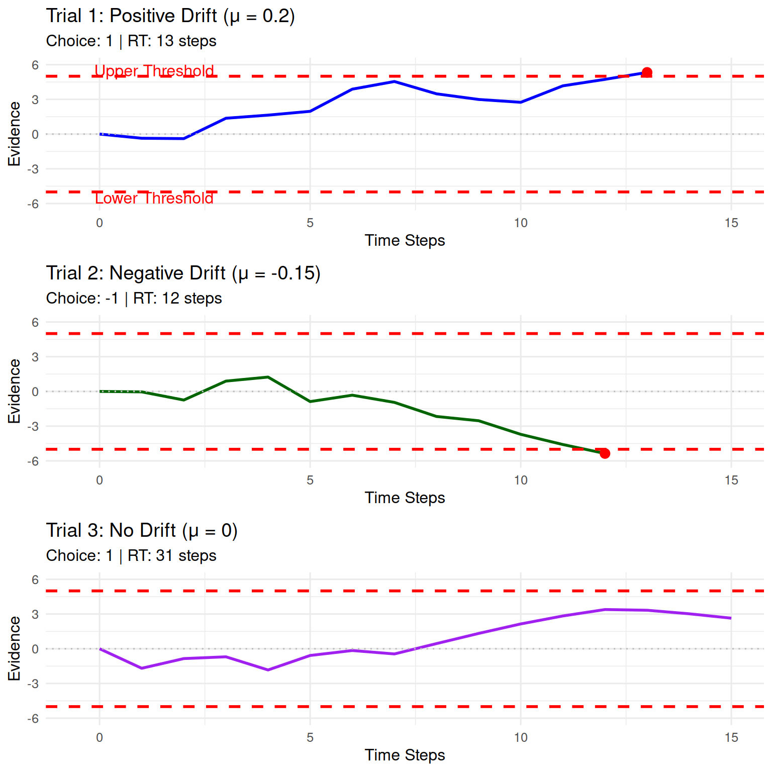
Key Observations: - Positive drift
tends to push evidence toward the upper threshold - Negative
drift tends to push evidence toward the lower threshold
- No drift creates a symmetric random walk where either
outcome is equally likely - The red dot shows where the
threshold was crossed - Noise creates the zigzag
pattern in the evidence accumulation
Exploring Parameter Effects
Let’s explore how different parameters affect the random walk behavior:
set.seed(456)

# Generate multiple trials with different parameters
param_trials <- list(
  low_noise = simulate_random_walk_trial(drift = 0.1, threshold = 5, sd_step = 0.5, return_path = TRUE),
  high_noise = simulate_random_walk_trial(drift = 0.1, threshold = 5, sd_step = 2, return_path = TRUE),
  low_threshold = simulate_random_walk_trial(drift = 0.1, threshold = 2, sd_step = 1, return_path = TRUE),
  high_threshold = simulate_random_walk_trial(drift = 0.1, threshold = 8, sd_step = 1, return_path = TRUE)
)

# Create comparison plots
param_plots <- list()

for (i in 1:length(param_trials)) {
  trial_name <- names(param_trials)[i]
  trial_data <- param_trials[[i]]

  df_temp <- data.frame(
    time = 0:(length(trial_data$evidence_path) - 1),
    evidence = trial_data$evidence_path
  )

  # Determine threshold value for plotting
  threshold_val <- switch(trial_name,
                         "low_threshold" = 2,
                         "high_threshold" = 8,
                         5)  # default

  param_plots[[i]] <- ggplot(df_temp, aes(x = time, y = evidence)) +
    geom_line(color = "steelblue", size = 1) +
    geom_hline(yintercept = c(-threshold_val, threshold_val),
               linetype = "dashed", color = "red", size = 1) +
    geom_hline(yintercept = 0, linetype = "dotted", color = "gray") +
    geom_point(data = df_temp[nrow(df_temp), ], color = "red", size = 3) +
    labs(title = switch(trial_name,
                       "low_noise" = "Low Noise (σ = 0.5)",
                       "high_noise" = "High Noise (σ = 2.0)",
                       "low_threshold" = "Low Threshold (a = 2)",
                       "high_threshold" = "High Threshold (a = 8)"),
         subtitle = paste("Choice:", trial_data$choice, "| RT:", trial_data$rt, "steps"),
         x = "Time Steps", y = "Evidence") +
    ylim(-10, 10) +
    xlim(-0.5, 20)
}

do.call(grid.arrange, c(param_plots, ncol = 2))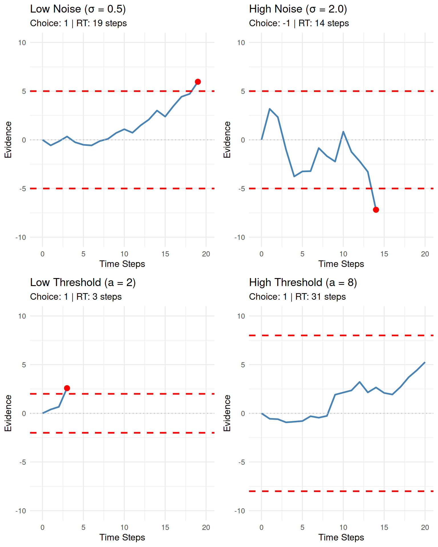
Simulating a Random Walk Experiment
To understand the statistical properties of the random walk model, we need to simulate many trials. Let’s conduct a comprehensive experiment:
set.seed(789)
n_sim_trials <- 1000

# Simulate experiment with moderate parameters
rw_data <- simulate_random_walk_experiment(
  n_trials = n_sim_trials,
  threshold = 10,
  drift = 0.05, # Slight positive drift
  sd_step = 1.5,
  show_progress = FALSE
)

# Display basic statistics
cat("Experiment Summary:\n")
## Experiment Summary:## Total trials simulated: 1000## Trials with valid decisions: 1000## Proportion of valid decisions: 1# Display the first few rows
knitr::kable(head(rw_data),
caption = "First 6 trials of the simulated random walk experiment.")| trial | choice | rt |
|---|---|---|
| 1 | -1 | 25 |
| 2 | 1 | 40 |
| 3 | -1 | 136 |
| 4 | -1 | 60 |
| 5 | 1 | 68 |
| 6 | 1 | 24 |
Analyzing Experiment Results
1. Choice Proportions and Accuracy
# Filter out NA choices and create summary
valid_choices <- rw_data %>%
  filter(!is.na(choice)) %>%
  mutate(choice_label = factor(choice,
                              levels = c(-1, 1),
                              labels = c("Lower Threshold (-1)", "Upper Threshold (1)")))

if(nrow(valid_choices) > 0) {
  # Calculate choice proportions
  choice_summary <- valid_choices %>%
    count(choice_label) %>%
    mutate(proportion = n / sum(n))

  # Create summary table
  knitr::kable(choice_summary %>%
               select(choice_label, n, proportion),
               col.names = c("Choice Outcome", "Count (N)", "Proportion"),
               caption = "Summary of Choice Proportions",
               digits = 3)

  # Create visualization
  p_choice <- ggplot(choice_summary, aes(x = choice_label, y = proportion, fill = choice_label)) +
    geom_bar(stat = "identity", color = "black", alpha = 0.8, width = 0.6) +
    geom_text(aes(label = percent(proportion, accuracy = 0.1)),
              vjust = -0.3, size = 4, fontface = "bold") +
    scale_y_continuous(labels = percent_format(accuracy = 1),
                      limits = c(0, max(choice_summary$proportion) * 1.1)) +
    scale_fill_manual(values = c("tomato", "lightblue")) +
    labs(title = "Choice Proportions in Random Walk Experiment",
         subtitle = paste("n =", nrow(valid_choices), "trials with positive drift (μ = 0.05)"),
         x = "Decision Outcome", y = "Proportion of Trials") +
    theme(legend.position = "none")

  print(p_choice)

  # Statistical test for bias
  if (length(unique(valid_choices$choice)) == 2) {
    bias_test <- binom.test(sum(valid_choices$choice == 1), nrow(valid_choices), p = 0.5)
    cat("\nStatistical Test for Bias:\n")
    cat("Binomial test p-value:", round(bias_test$p.value, 6), "\n")
    cat("95% CI for upper threshold proportion:",
        round(bias_test$conf.int[1], 3), "-", round(bias_test$conf.int[2], 3), "\n")
  }
} else {
  cat("No valid choices to analyze (all trials may have resulted in timeouts).\n")
}
##
## Statistical Test for Bias:
## Binomial test p-value: 0
## 95% CI for upper threshold proportion: 0.578 - 0.639
With a positive drift (μ = 0.05), we expect more choices for the upper threshold, which represents the “correct” or “preferred” response in a decision-making context.
2. Reaction Time (RT) Distributions
if(nrow(valid_choices) > 0) {
  # RT summary statistics
  rt_summary <- valid_choices %>%
    group_by(choice_label) %>%
    summarise(
      N = n(),
      Mean_RT = round(mean(rt, na.rm = TRUE), 1),
      Median_RT = round(median(rt, na.rm = TRUE), 1),
      SD_RT = round(sd(rt, na.rm = TRUE), 1),
      Min_RT = min(rt, na.rm = TRUE),
      Max_RT = max(rt, na.rm = TRUE),
      .groups = "drop"
    )

  knitr::kable(rt_summary,
               caption = "Summary Statistics for RTs by Choice Outcome")

  # Create RT distribution plots
  p1 <- ggplot(valid_choices, aes(x = rt, fill = choice_label)) +
    geom_histogram(bins = 30, alpha = 0.7, color = "black") +
    facet_wrap(~choice_label, scales = "free_y", ncol = 1) +
    scale_fill_manual(values = c("tomato", "lightblue")) +
    labs(title = "RT Distributions by Choice Outcome",
         x = "Reaction Time (Steps)", y = "Frequency",
         fill = "Choice") +
    theme(legend.position = "none")

  # Box plot comparison
  p2 <- ggplot(valid_choices, aes(x = choice_label, y = rt, fill = choice_label)) +
    geom_boxplot(alpha = 0.7, width = 0.6) +
    geom_jitter(width = 0.2, alpha = 0.3, size = 0.5) +
    scale_fill_manual(values = c("tomato", "lightblue")) +
    labs(title = "RT Comparison Between Choices",
         x = "Choice Outcome", y = "Reaction Time (Steps)") +
    theme(legend.position = "none")

  # Density overlay
  p3 <- ggplot(valid_choices, aes(x = rt, color = choice_label, fill = choice_label)) +
    geom_density(alpha = 0.3, size = 1) +
    scale_color_manual(values = c("darkred", "darkblue")) +
    scale_fill_manual(values = c("tomato", "lightblue")) +
    labs(title = "RT Density Distributions",
         x = "Reaction Time (Steps)", y = "Density",
         color = "Choice", fill = "Choice") +
    theme(legend.position = "bottom")

  # Arrange plots
  grid.arrange(p1, arrangeGrob(p2, p3, ncol = 2), ncol = 1, heights = c(2, 1))

  # Statistical comparison
  if (length(unique(valid_choices$choice)) == 2) {
    rt_test <- t.test(rt ~ choice, data = valid_choices)
    cat("\nRT Comparison Between Choices:\n")
    cat("t-test p-value:", round(rt_test$p.value, 6), "\n")
    cat("Mean difference (Upper - Lower):", round(rt_test$estimate[1] - rt_test$estimate[2], 2), "steps\n")
  }
}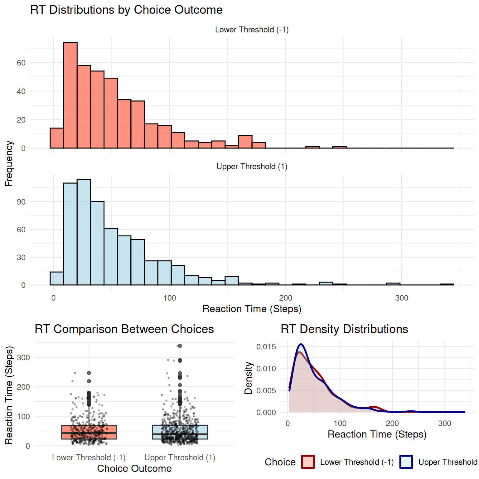
##
## RT Comparison Between Choices:
## t-test p-value: 0.959409
## Mean difference (Upper - Lower): 0.14 steps
Key Insights from RT Analysis: - RT distributions are typically positively skewed (long right tail) - Faster RTs often occur for the choice favored by drift - Slower RTs may indicate more difficult decisions or unfavorable drift - The variability in RTs reflects the stochastic nature of the process
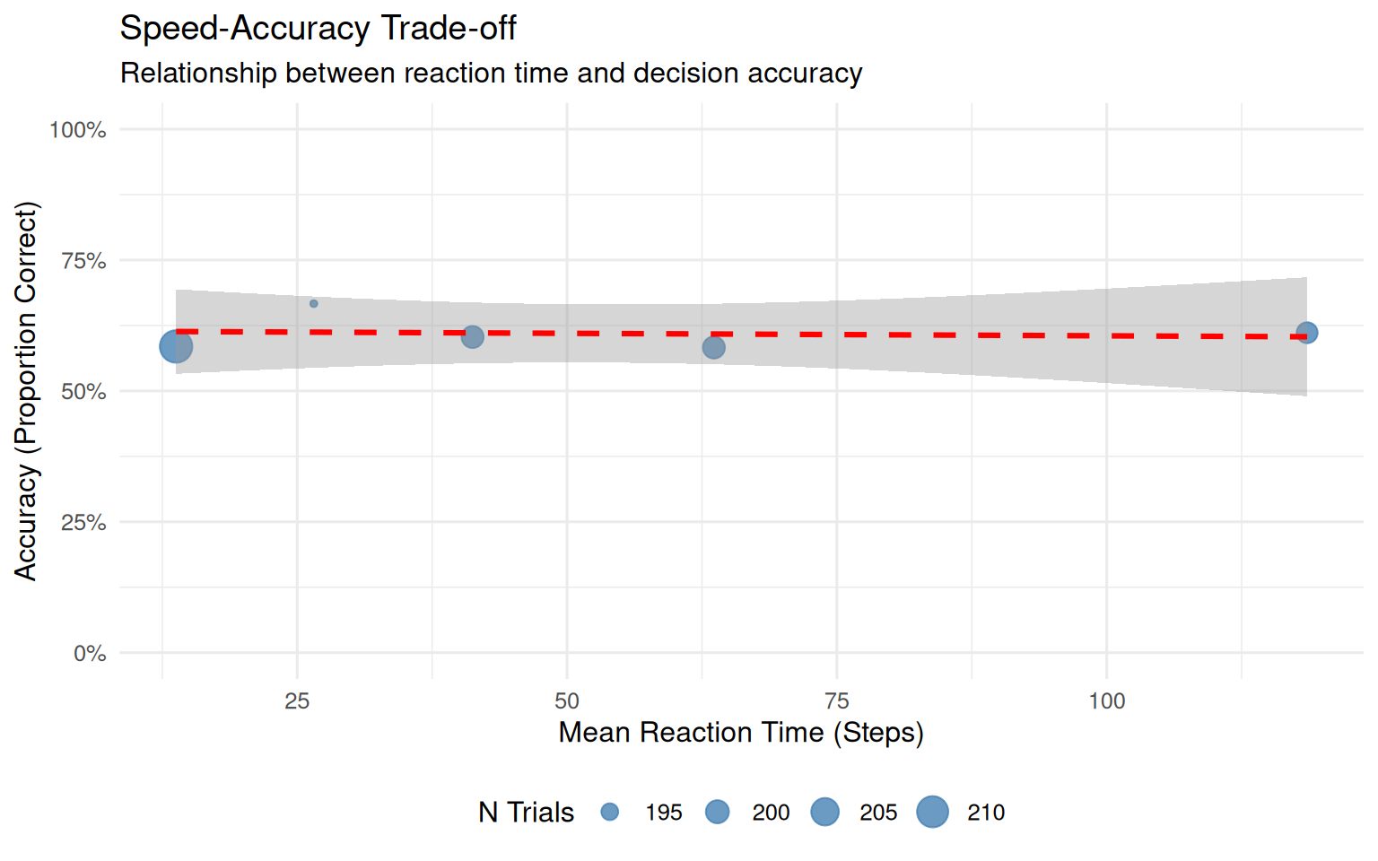
3. Speed-Accuracy Trade-off
if(nrow(valid_choices) > 0) {
  # Define "correct" responses as upper threshold (since drift is positive)
  accuracy_data <- valid_choices %>%
    mutate(
      correct = choice == 1,  # Upper threshold is "correct" with positive drift
      rt_bin = cut(rt, breaks = quantile(rt, probs = seq(0, 1, 0.2)),
                   include.lowest = TRUE, labels = c("Fastest", "Fast", "Medium", "Slow", "Slowest"))
    )

  # Calculate accuracy by RT bins
  speed_acc_summary <- accuracy_data %>%
    group_by(rt_bin) %>%
    summarise(
      N = n(),
      Accuracy = mean(correct),
      Mean_RT = mean(rt),
      .groups = "drop"
    ) %>%
    filter(!is.na(rt_bin))

  knitr::kable(speed_acc_summary,
               caption = "Speed-Accuracy Analysis: Accuracy by RT Quintiles",
               digits = 3)

  # Visualize speed-accuracy trade-off
  p_speed_acc <- ggplot(speed_acc_summary, aes(x = Mean_RT, y = Accuracy)) +
    geom_point(aes(size = N), color = "steelblue", alpha = 0.8) +
    geom_smooth(method = "lm", se = TRUE, color = "red", linetype = "dashed") +
    scale_y_continuous(labels = percent_format(), limits = c(0, 1)) +
    labs(title = "Speed-Accuracy Trade-off",
         subtitle = "Relationship between reaction time and decision accuracy",
         x = "Mean Reaction Time (Steps)",
         y = "Accuracy (Proportion Correct)",
         size = "N Trials") +
    theme(legend.position = "bottom")

  print(p_speed_acc)
}
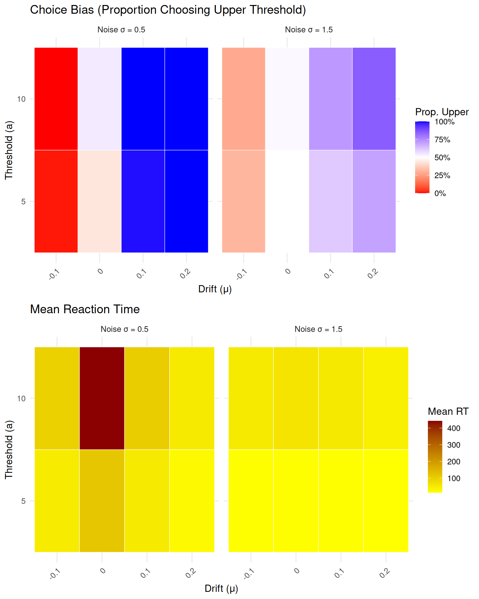
Parameter Sensitivity Analysis
Let’s explore how different parameter values affect model behavior:
set.seed(999)

# Define parameter combinations to test
param_combinations <- expand.grid(
  drift = c(-0.1, 0, 0.1, 0.2),
  threshold = c(5, 10),
  sd_step = c(0.5, 1.5)
)

# Simulate smaller experiments for each combination
sensitivity_results <- list()

for (i in 1:nrow(param_combinations)) {
  params <- param_combinations[i, ]

  sim_data <- simulate_random_walk_experiment(
    n_trials = 200,  # Smaller n for speed
    drift = params$drift,
    threshold = params$threshold,
    sd_step = params$sd_step,
    show_progress = FALSE
  )

  # Calculate summary statistics
  valid_trials <- sim_data[!is.na(sim_data$choice), ]

  if (nrow(valid_trials) > 0) {
    sensitivity_results[[i]] <- data.frame(
      drift = params$drift,
      threshold = params$threshold,
      sd_step = params$sd_step,
      prop_upper = mean(valid_trials$choice == 1),
      mean_rt = mean(valid_trials$rt),
      prop_valid = nrow(valid_trials) / 200
    )
  }
}

# Combine results
sensitivity_df <- do.call(rbind, sensitivity_results)

# Create visualizations
if (nrow(sensitivity_df) > 0) {
  # Choice proportion heatmap
  p1 <- ggplot(sensitivity_df, aes(x = factor(drift), y = factor(threshold), fill = prop_upper)) +
    geom_tile(color = "white") +
    facet_wrap(~paste("Noise σ =", sd_step)) +
    scale_fill_gradient2(low = "red", mid = "white", high = "blue", midpoint = 0.5,
                        labels = percent_format()) +
    labs(title = "Choice Bias (Proportion Choosing Upper Threshold)",
         x = "Drift (μ)", y = "Threshold (a)", fill = "Prop. Upper") +
    theme(axis.text.x = element_text(angle = 45, hjust = 1))

  # Mean RT heatmap
  p2 <- ggplot(sensitivity_df, aes(x = factor(drift), y = factor(threshold), fill = mean_rt)) +
    geom_tile(color = "white") +
    facet_wrap(~paste("Noise σ =", sd_step)) +
    scale_fill_gradient(low = "yellow", high = "darkred") +
    labs(title = "Mean Reaction Time",
         x = "Drift (μ)", y = "Threshold (a)", fill = "Mean RT") +
    theme(axis.text.x = element_text(angle = 45, hjust = 1))

  grid.arrange(p1, p2, ncol = 1)
}
Summary and Next Steps
This vignette introduced the fundamental concepts of random walks and their implementation in R. We’ve covered:
Key Concepts Learned:
- Mathematical foundation of discrete-time random walks
- Parameter effects: drift, threshold, and noise
- Simulation methods for single trials and
experiments
- Statistical analysis of choice proportions and RT distributions
- Speed-accuracy trade-offs in decision making
- Parameter sensitivity analysis
Important Insights:
- Drift creates bias toward one choice option
- Threshold controls the speed-accuracy trade-off
- Noise increases variability in both choices and RTs
- RT distributions are typically positively skewed
- The model exhibits realistic speed-accuracy relationships
Connection to Cognitive Science:
Random walks provide the foundation for understanding: - Evidence accumulation in perceptual decisions - Response time distributions in choice tasks - Confidence and decision certainty - Individual differences in decision-making strategies